 Marina DiPonio
Ambient · Underwater
Marina DiPonio
 ● Brand · Web · QA
Brand identity, web design & quality control · Creative & Web Internship · Summer 2026
I joined Wellness Eternal, a wellness marketing agency, as its Creative and Web/App Development Intern from July 21 to August 31, 2026: about 100 part-time hours over six weeks, reporting to the CEO, the CMO, the Head of Operations, and a project lead. The work covered brand identity, web design, wireframing, and quality control.
Before I build on a document, I check it against what is actually live. Specs, names, and brand kits drift over time, so reconciling them first is where most of the work on this page started.
A 73-file identity system with rules for using it. The full brand for the Wellness Index Report podcast, including its landing page. A social template system anyone on the team can use.
A logo is only as good as the worst place someone else puts it. The goal was a set the team could use correctly without having to ask me.
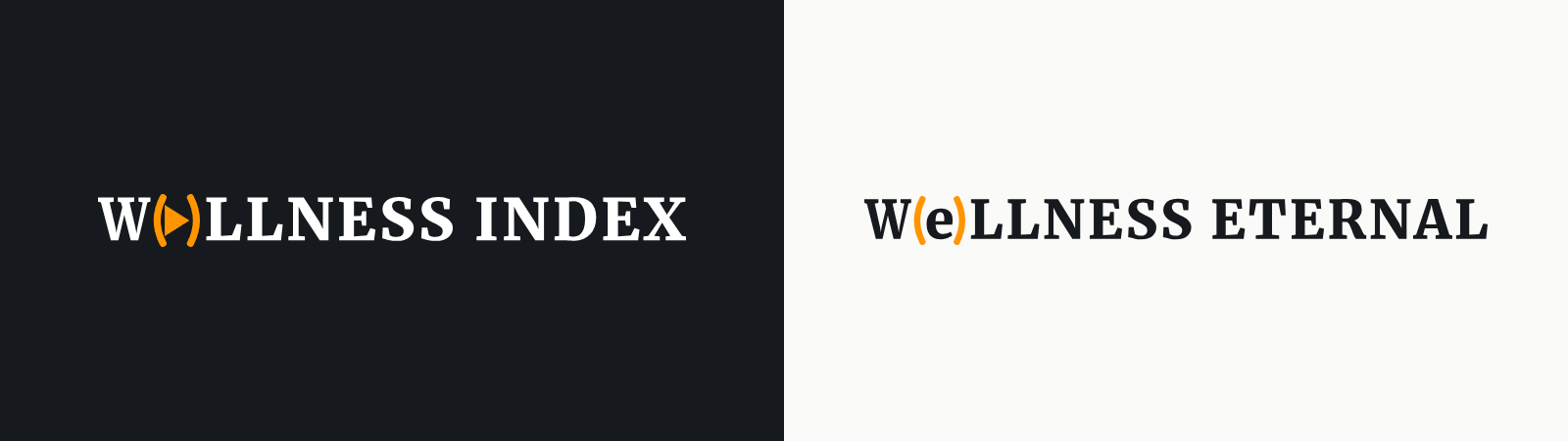
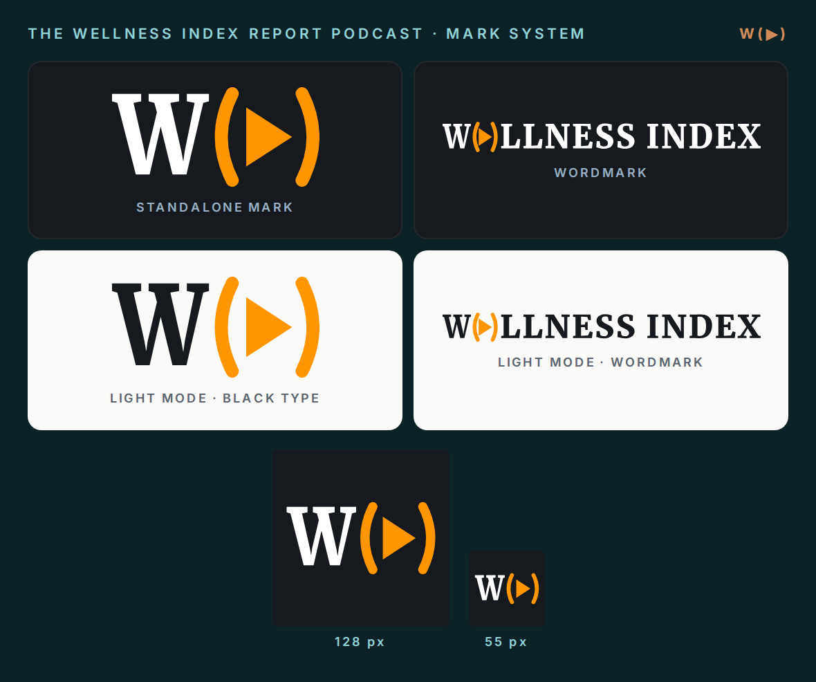
Nine lockups: the W(▶) mark, square and circle versions for icons and avatars, a compact paren mark and its square, two wordmarks for the parent name, an Index wordmark for the podcast, and a stacked version. Each comes in four colorways, as SVG and 3000 px PNG, with every letterform converted to outlines so nothing depends on an installed font.
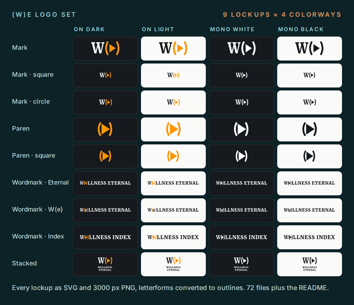
The set ships with a README. Minimum widths come from a 7 px cap-height threshold, the size where heavy serif type stops reading, so the mark holds down to 18 px wide and the longest wordmark needs 111 px. Clear space is half the cap height, so it scales with the type.
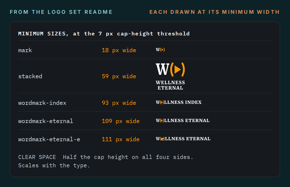
Every mark sits on a brand spec I sampled from the live site’s rendered CSS (more under Verification), so the logos match what visitors actually see.
Anyone on the team can pick the right lockup, check its minimum size, and use it correctly without guesswork. The README also flags the two decisions that belonged to the brand owner, not to me.
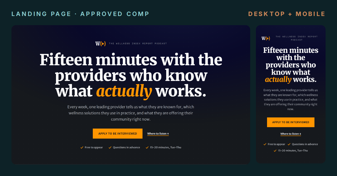
The interview application in the copy deck had 16 fields. I mapped each one against what the editorial team needs in order to decide, and kept those eight on the page. Four moved into the booking and pre-interview emails, three came off, and the newsletter opt-in became an optional checkbox. Title came back in the fifth review round.
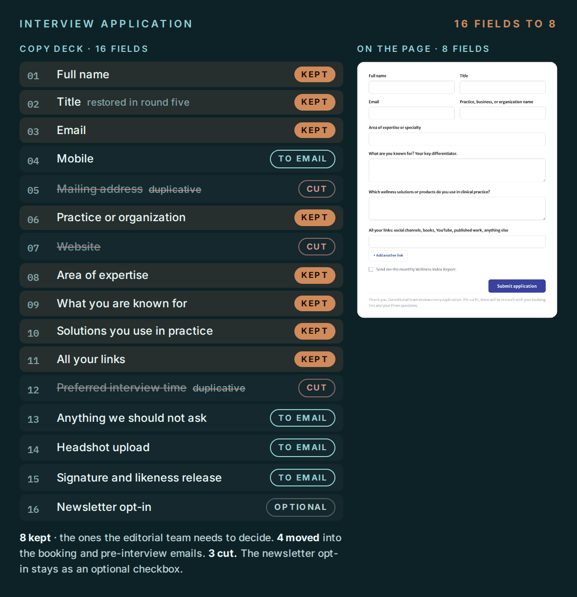
The signature and the high-resolution upload were the two hardest fields to finish on a phone. Both now come by email after booking, once the provider has picked a slot.
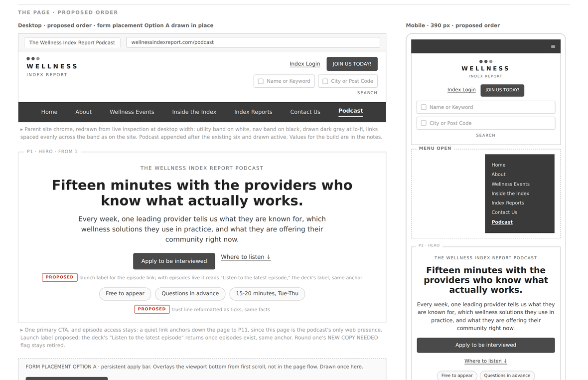
I wireframed the landing page for desktop and mobile from the CEO’s copy deck, ordered for the provider deciding whether to apply. Every line that was not verbatim from the deck got a PROPOSED flag for her line-by-line approval. A journey map and a follow-up survey went with it.
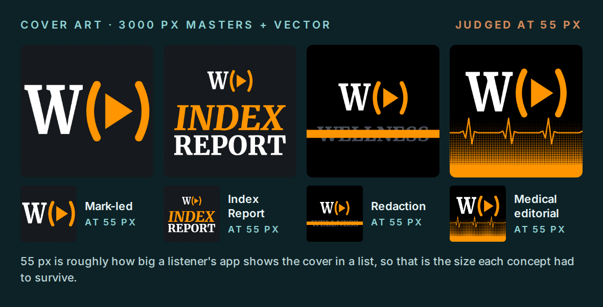
I started with twenty concepts, judged every one at 55 px rather than at presentation size, and reworked all twenty when the show was renamed. W(▶), a play button held in the brand’s parentheses, won the A/B rounds that followed, and round three settled its geometry. The final system: W(▶) as a standalone mark, a W(▶)LLNESS INDEX wordmark, and a black-type version for light backgrounds.
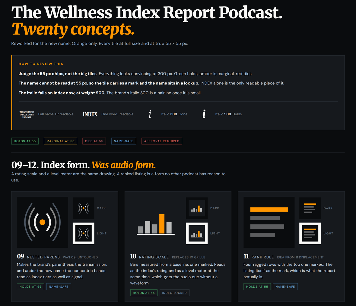
Podcast apps list a show at about 55 px. I built every cover concept as a 3000 px master and in vector, then judged it at 55 px, the size a listener actually sees. At that size a long show name disappears, so the tile carries the mark and the name lives in the wordmark.
The podcast posts to Wellness Eternal’s own Instagram feed, so it could not look like a separate company. The brand kit runs light and dark themes on the parent’s orange, type, and parentheses.
Consistent, on-brand social posts that anyone on the team can make.
Ten template families for Instagram, Facebook, and LinkedIn, covering features, the monthly Index Report, provider spotlights, podcast episodes, stats, and calls to action. Every master is 1080 × 1350 and resizes to Story and landscape by holding three things in place: the corner wordmark, the single orange element, and the crop.
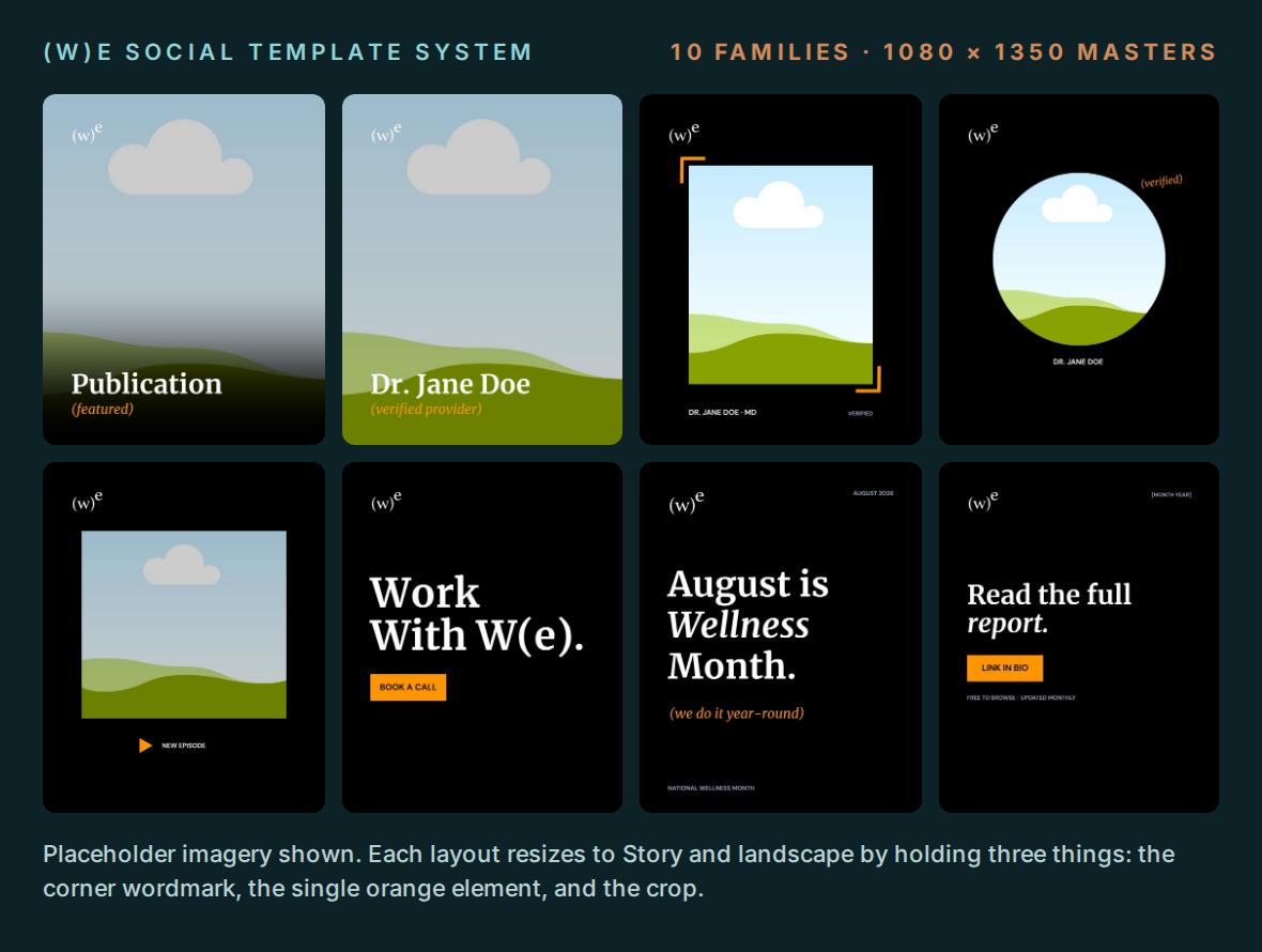
Four rules keep a post on brand in anyone’s hands. Lead with the artifact, not decoration. Orange goes on one element per board. Merriweather carries display; DM Sans carries anything measured. No more than five display words and one label.
The case-study carousel follows the project lead’s brief: two five-slide options that tell a client’s story without client creative, names, logos, or attributed quotes.
I was part time. The most useful thing I could build was something that kept producing on-brand work on the days I wasn’t there.
Every catch below started the same way: I opened the live product and compared it with the document it was supposed to match.
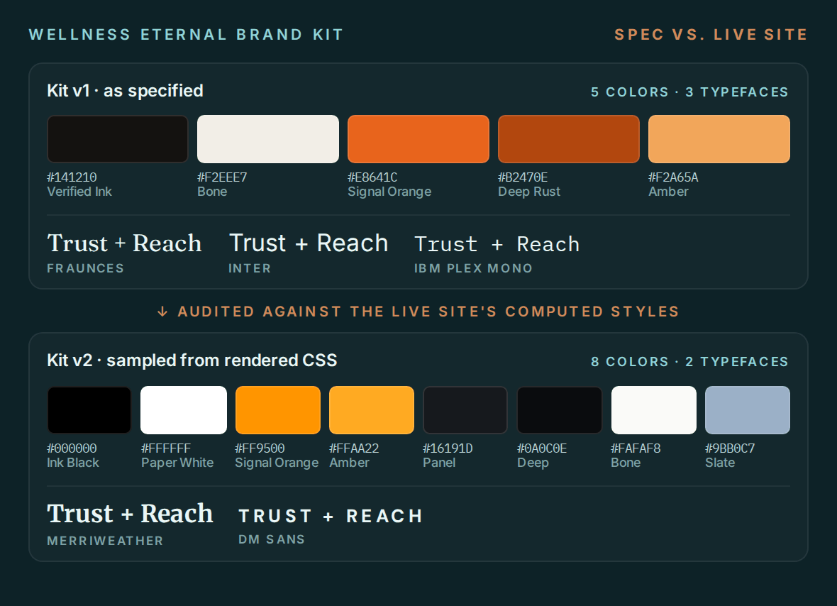
I audited the brand kit against the live site’s computed styles and rebuilt the spec from what actually rendered: true black and white, a brighter signal orange, Merriweather and DM Sans. From then on, new work had an accurate base.
I reconciled the Wellness Index Report name across the site, where it appeared four different ways, and against the podcast directories, which still listed the show’s old name. Doing it before the logo was final meant the mark only had to be built once.
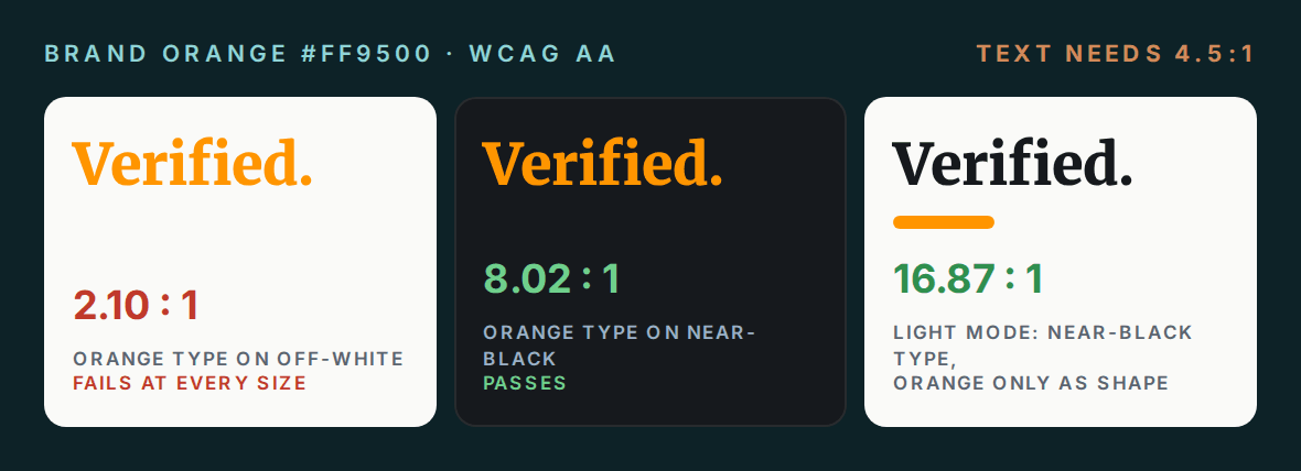
I contrast-tested the brand orange on the light ground: 2.10:1, against the 4.5:1 that text needs. I designed the light-mode variants around that result: near-black type, with orange kept to shapes.
I settled a rename-or-start-fresh question on the podcast feed that had been open for three days: the existing feed carried 93 five-star ratings, so it gets renamed in place and keeps them.
For a medical education client, I ran a full accuracy review: 73 issues across 10 files and 199 panels, 31 of them unambiguous factual errors. I opened and confirmed every one by eye before it went into the report, which shipped as a branded PDF.
The material was headed to practicing physicians. I caught a mitochondrion labeled as the nucleus in a course diagram, with the real nucleus left unlabeled, before it reached production slides. I also caught “Nitric Acid” written for nitric oxide in a biochemistry module: one is a signaling molecule, the other a corrosive acid.
For a medical device client, I checked every spec and price in the product materials against the source, and flagged errors on three separate review passes. On a six-figure device, a wrong spec is a sales problem, not a typo.
I rebuilt a client’s brand kit from their live site after finding its fonts no longer matched, so everything made from it would ship on brand.
Accessibility